Clear stickers or labels, sometimes referred to as transparent stickers, are printed on clear polypropylene (PP) or vinyl material. One advantage of this material is that it allows the product's colour to show through the label, creating a window effect. Alternatively, it can give the illusion of having no border on a complex shape, giving a seamless professional look or allowing it to have a cleaner edge on the overall finished appearance.
When preparing these files for print, they need to be set up with additional processes to allow for white ink trapping or choking, also known as a white underpin.
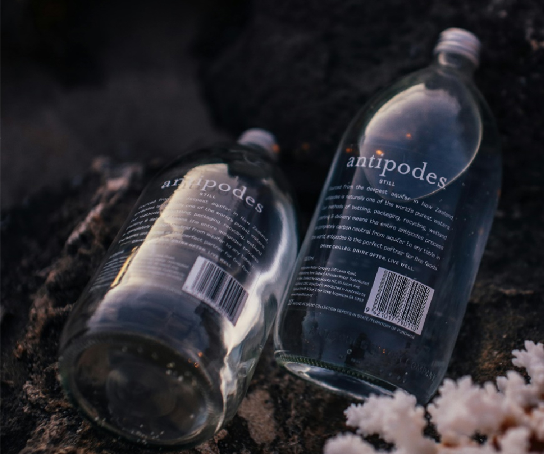
What Are Clear Stickers and Labels?
Also referred to as; transparent Stickers, transparent labels, Window Stickers
A Clear Sticker is printed on transparent material and can have many uses. They are often used for packaging or branding, and they can come in different forms such as a Standard Clear Sticker, a Clear Sticker with White Ink, a Reverse Printed (Window) Sticker or a Frosted Clear Sticker.
Clear stickers are limited to the type of material they can be made from as it needs to have a plastic form to give it a transparent or translucent ability.
- Waterproof and weather-resistant: Designed for products exposed to moisture, such as cosmetics, beverages, and household goods, ensuring longevity in humid or wet environments.
- Professional Look: Allows the colour of the product or surface to show through, ideal for retaining brand colours and consistency across materials and products.
- Customisable effects: varying opacities of white ink can be applied to a clear label, allowing it to transition from opaque to translucent or fully transparent.
- White Ink Underprint Compatibility – Premium HP White Ink underpin ensures a close match to White PP while preventing coloured elements from appearing faded or translucent on clear material. This is equivalent to applying a standard white ink layer twice onto the material.
Best for:
- Products with strong brand colours
- Window Stickers
- Giving the illusion of no border
Design Tip: Choose Simple, High-Contrast Colours for Text-Based Designs
From our collective industry experience, we've found that text-heavy artwork often works best in either white or black. These two colours provide the strongest contrast on most backgrounds, whether light or dark, making text significantly easier to read. This is particularly important when dealing with fine or intricate typography, where clarity is paramount. Sticking to high-contrast colours also simplifies the printing process and ensures your messaging always stands out.
How to set up Clear Stickers and Labels
If your sticker or label has been designed with colour elements, it is best to back these with a white ink layer to preserve the colour’s vibrancy and opacity. However, if you prefer a translucent effect on your stickers or labels, printing your colour labels without a white underpin will create a semi-transparent appearance. Darker colours may remain opaque, but lighter colours will tint the clear material slightly. This does have its drawbacks, as without white ink, you won’t have full control over the opacity of the label. Very pale colours may appear extremely faint or barely visible when printed without a white ink backing.
Best for:
- Creating a translucent effect
- Artworks that only have black ink
- Labels applied to white surfaces
Design Tip: When to Skip White Ink on Dark or Vibrant Colours
In our real-world printing experience, black ink tends to be naturally opaque on most label materials, so if your entire design is black, you may not need a white-ink layer at all. Similarly, certain CMYK mixes, like C0, M100, Y100, K0 (RED), often retain strong vibrancy even when printed without a white backing, albeit with a slight translucency. If you're happy with a slightly transparent finish and the product beneath is relatively neutral, omitting white ink can still yield excellent results while streamlining your production.
How to set up Clear Stickers and Labels with White Ink
If your sticker or label has been designed with colour elements, it is best to back them with a white ink layer to preserve the colour’s vibrancy and opacity.
To do this, if you are designing your artwork in design software such as Adobe Illustrator or Adobe Photoshop, lock and hide your final design on one layer, then duplicate it to a second layer underneath. In the second layer, change all coloured and white areas to a single white ink fill, leaving only the transparent areas unfilled.
For visibility, it is best to turn these white ink elements into a spot colour, such as grey or a contrasting colour like 100% magenta or 100% cyan. This ensures that these elements are clearly distinguishable from the rest of the label's design.
Creating the white ink as a spot colour ensures visibility and alerts the designer to its presence, even when hidden beneath colour.
When underpinning white ink beneath your colour inks, it’s best to choke the white layer. Choking ensures the white ink aligns properly with the colour layers while maintaining clean edges, preventing misregistration or halos. Typically, the white ink layer is slightly reduced so that it doesn’t extend beyond the colour inks, even if minor movement occurs on the print bed, which could otherwise cause misalignment issues.
If your label only contains white ink with no other colours, you don’t need multiple layers or to choke the white ink. Simply supply your artwork as white on a transparent background or use a spot colour to indicate where the white ink should be applied. It's always best practice to include notes with your order so the design team knows exactly how you expect your label to print.
Best for:
- Ensuring the colours are opaque
- Retaining vibrancy of colours
- Improving print quality
- Labels being applied to a coloured surface so that the surface becomes the background colour while having white text that stands out
Sales Tip: Use Clear Stock to Simplify Complex Shapes and Save Costs
Clear stickers or labels can also provide the illusion of no border, especially for intricate designs that would otherwise require detailed or multiple cut lines.
By applying white ink (also known as a “white underpin”) only beneath the printed elements and leaving the rest of the label transparent, you can mimic complex silhouettes without the need for individual cutouts. Instead, one simple shape is cut, and the transparent areas create a “faux” outline. This approach reduces production complexity, cuts costs, and maintains a sleek, professional finish.
When setting up files for transparent labels, remember to:
- Include white ink layers for any areas that need to remain opaque (this process is sometimes referred to as white ink trapping or choking).
- Ensure your design software clearly separates coloured artwork from white ink to avoid accidental overlap or missing white layers.
By planning the transparent regions cleverly, you'll achieve a custom-look label with minimal cut lines and maximal visual impact, all without the extra expense of highly intricate die-cuts.
Design Tip: Why Add White Ink Backing on White Objects?
It might seem unnecessary to use a white-ink backing when placing a design onto a white surface—but in many cases we have found that adding a white underprinting creates richer, more vibrant results. By adding a white layer beneath your colours, you form a denser foundation that prevents any translucency and ensures true-to-design saturation.
However, if you want the label's unprinted areas to blend seamlessly with a product's own white shade (e.g., to create a “no-label look”), skipping the white ink can sometimes be beneficial. This is especially true when the product itself is a clean, bright white, making it easier for the transparent label edges (or white areas in your artwork) to merge with the container's colour. In such cases, if there's no colour to underpin, you can achieve a subtle, more natural finish without adding a white ink layer.
How to set up Clear Stickers and Labels with Black Ink
If your sticker or label only contains black ink, it does not require white ink, as black is naturally more opaque on clear material.
For these labels, simply supply them as you want them to be printed, with no additional processes or white ink.
For text, supply your black as CMYK: 0,0,0,100. For backgrounds use CMYK: 50,50,50,100, as this enriches a rich black.
This is especially useful when applying the sticker or label to a coloured surface, ensuring the text stands out while maintaining the product’s original colour.
Design Tip: Opt for Medium or Bold Fonts on Clear Labels
From our
hands-on experience, when applying clear labels with black text onto coloured products, thin or ultra-light fonts can easily get lost if the background contrast isn't high enough. To ensure your text remains legible and eye-catching, choose medium or bold weights. For instance:
- Open Sans Bold
- Montserrat Semi-Bold
- Helvetica Neue Medium
- Arial Black
These fonts provide strong, crisp lines that stand out against various coloured backgrounds. By selecting a heavier weight, you'll avoid readability issues that often plague lighter typefaces on transparent materials.
Best for:
- Monochrome designs
- Ingredients labels
- Labels being applied to a coloured surface so that the surface becomes the background colour
Which Should I Choose?
Over years of working with clear labels on everything from cosmetics to beverage containers, we've seen how the choice between standard clear stock, white ink, or black ink can dramatically affect your final look. Here's a quick guide based on real-world results:
Choose Standard Clear Stickers or Labels if:
- You want translucent or see-through colours, or if your design is black-only on a lightly coloured or white product.
- A standard clear label lets your product's colour or texture show through the unprinted areas, which can create a subtle, almost "no-label" effect.
- Keep in mind that without a white backing, colours may appear less vibrant or slightly influenced by the product’s surface colour.
Choose Clear Stickers or Labels with White Ink if:
- You need bold, opaque colours that won't get washed out by a darker or more vibrant background.
- This is especially important if your product has a strongly coloured surface, as white ink underprinting prevents colours from appearing dull or translucent.
- White ink can also be used selectively, so parts of the label remain clear while critical design elements (like text or graphics) stay opaque and bright.
Choose Clear Stickers or Labels with Black Ink Only if:
- You're placing the label on a coloured surface and only require black text or images, no extra colours or white ink needed.
- Black ink naturally stands out on most backgrounds, though be cautious if the product itself is very dark; consider a slightly bolder font or higher contrast to improve legibility.
- This is a cost-effective way to achieve a sleek, minimal look, even more-so for simple branding or product identification.
When in doubt,
evaluate your product's background colour, the required legibility, and how important vibrancy is to your brand. If your colours must stand out, especially on tinted, dark, or patterned surfaces, adding white ink is essential. If you'd like a subtle, see-through effect or only need black text, standard clear stock may suffice. By choosing the right option for your product and brand aesthetic, you'll be sure your labels truly stand out on the shelf.
Additional Tips and Advanced Options
Gradients of White Ink
Many assume white ink is simply "all or nothing," but in reality, we can control its application to create subtle gradients for partially translucent areas. This approach is often requested by customers looking to mimic metallic finishes. While we don’t offer metallic ink, adding a graduated white layer behind coloured gradients can give a cool, dynamic shine effect at no additional cost. For instance, we often see vape label designs changing from a solid purple to a much lighter tone; by varying the white ink density beneath each section, we ensure the darker colour remains vibrant while the lighter colours stay softly translucent. If this sounds appealing, speak to our Sales Team to explore what's possible with white ink gradients for your specific artwork.
Metallic on Clear
For customers who want that shimmering, high-end appearance, we can incorporate metallic designs alongside transparent areas. This way it keeps the clear aesthetic yet adds a distinctive metallic shine in chosen parts of the artwork. By strategically layering white ink in the right places, we can fine-tune how much light reflects off the metallic layer, giving you more control than a simple “all-or-nothing” treatment. This technique is highly customisable, so contact us if you're looking for a sleek, upscale finish without significantly increasing production costs.