What are Metallic labels?
Also referred to as; Silver Labels, Gold Labels, Shiny Labels, Metallic Finish Labels
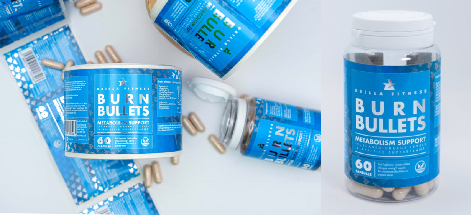
Metallic labels are created by printing slightly translucent inks onto a silver substrate to achieve a metallic effect. We can use both existing CMYK values as well as a library of metallic swatches pre-set by our software provider Colour-Logic. Metallic labels and stickers can be supplied in multiple ways, on Roll, Sheets, and Singles. Metallic labels also utilise an additional ink, 'Premium White', to control the opacity of the ink printed onto the silver material. This can be used to combine metallic and non-metallic areas on the same label.
Metallic labels offer a sleek, reflective finish that enhances product appeal, giving your labels a premium look. Made from waterproof polypropylene, they are highly durable, weatherproof, and cost-effective. Their strong adhesive ensures they stick securely to multiple surfaces, including glass, plastic, and metal. With sharp, vibrant printing, metallic labels are perfect for branding and packaging, adding a high-end touch to beauty products, toiletries, candles, beverages, and more.
Sales Tip: Using Metallic Backing to Hide Underlying Surfaces
We often work with customers who need labels to cover writing or older badges on appliances and machinery. In these cases, opting for a metallic material with a full white ink backing is a proven solution. The silver layer combined with white underprint provides extra thickness and density, effectively obscuring what's beneath the label. We have many repeat customers who rely on this technique for a neat, seamless appearance, helping their labels both stand out and conceal any unwanted areas.
Setting up your artwork
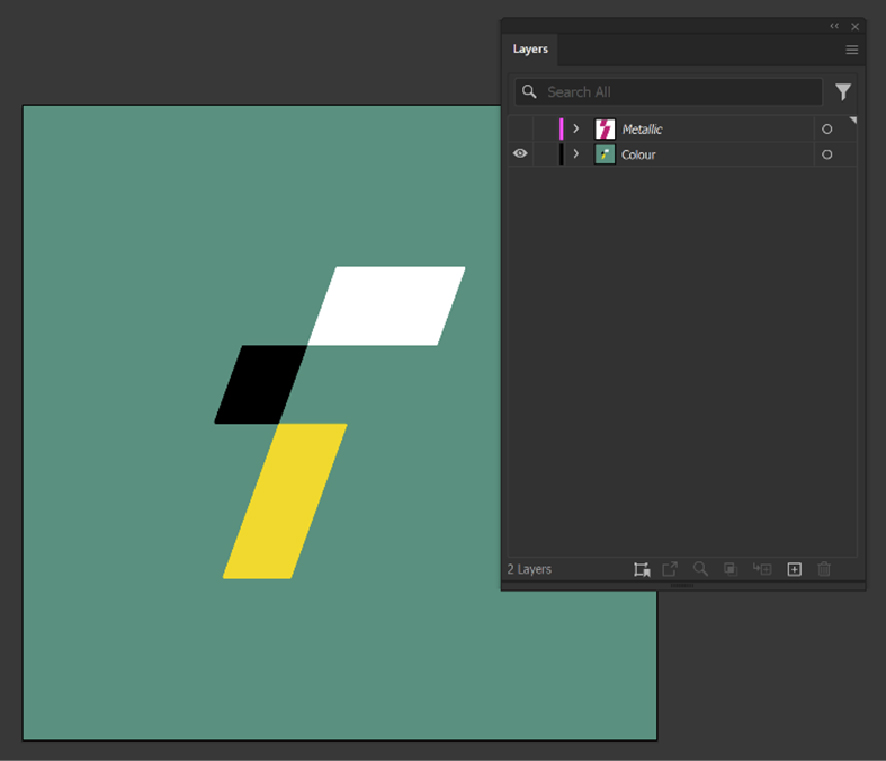
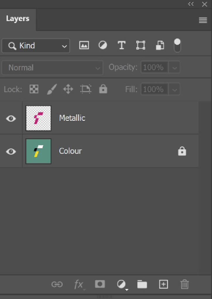
Set up your artwork in your preferred design package, for example, Adobe Illustrator or Adobe Photoshop. There are a couple of ways to indicate metallic areas in your design. You can either create your design as usual and include detailed notes specifying which areas should be metallic or non-metallic, or you can set up a separate named layer in your artwork to distinguish between metallic and non-metallic elements. You can achieve this by copying your metallic parts to a new layer called 'Metallic' and changing the colours to a strong colour like 100% magenta, effectively working like an overlay to let us know where your artwork should be metallic.
Design Tip: Improve Contrast with Metallic Colours
Drawing on our years of experience working with metallic hues, we've learned that contrast is important when two metallic tones meet. Metallic inks catch the light differently, so low-contrast pairings, like gold text on a pink metallic background, often appear faint or illegible. To avoid muddled designs:
- Select metallic colours that contrast strongly (e.g., darker backgrounds with lighter metallic text, or vice versa).
- A subtle outline in a neutral colour can help metallic text be differentiated from another metallic surface.
- Metallic shifts dramatically under certain angles and light, so preview your design in a multitude of environments.
By using these tips, you'll create eye-catching metallic labels that remain both elegant and legible.
Vector Artwork Using Adobe Illustrator
Adobe Illustrator can be used to set up your metallic labels, due to its vectored elements metallic areas can be easily selected.
Open your artwork and create a new layer named 'Metallic'. Duplicate your artwork onto this layer, then hide the original to prevent mistakes. Select the areas you want to be metallic and change them to a bright, stand-out colour like 100% magenta. The non-metallic areas can then be deleted. This layer will display only the metallic elements, while the rest of your design will print with a white ink backing to create a non-metallic finish in those areas.
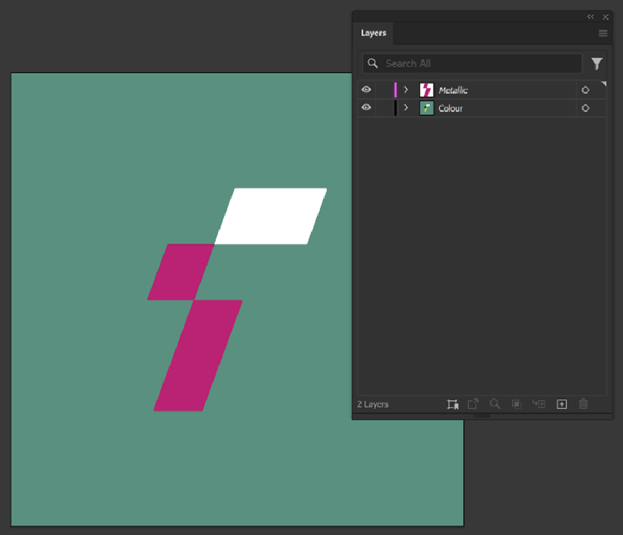
If you want your entire artwork to be metallic, simply select the areas of white that need to remain white; otherwise, they will print as silver.
Design Tip: Simplify Metallic Overlaps by Choosing Metallic Black
Through our countless tests with various metallic combinations, one consistent finding has emerged: metallic black is the best choice when it meets another metallic colour, either side by side or layered. By avoiding white ink beneath the black, you eliminate the subtle "halo" effect that can occur if white migrates behind the metallic layer. Yet you'll still achieve the deep, rich tone you expect from black ink, ensuring your design looks professional without any distracting outlines.
Bitmap/Raster Artwork Using Adobe Photoshop
Adobe Photoshop can also be used to create and edit metallic labels. There are two options available for flattened artwork: you can either highlight specific metallic areas in a similar way to Illustrator, or we can apply a metallic layer to the artwork using an automatic Colour-Logic conversion, which intelligently selects metallic tones to create a sheen effect across the entire design.
If you want specific areas of your design to be metallic or non-metallic, you can inform us in one of two ways: either by adding detailed design notes specifying which areas should have a metallic finish or by creating a new layer in your artwork for metallic elements.
Open your artwork and create a new layer named 'Metallic'. Duplicate your artwork onto this layer, then hide the original to prevent accidental changes. Select the areas you want to be metallic and change them to a bright, stand-out colour like 100% magenta. The non-metallic areas can then be deleted. This layer will display only the metallic elements, while the rest of your design will print with a white ink backing to create a non-metallic finish in those areas.
Design Tip: Keep DPI High for Metallic Accuracy
There's a direct link between image resolution and how faithfully metallic colours appear in print. To ensure your metallic tones remain sharp and accurate, set your Photoshop documents to 300–600 DPI. Lower resolutions often produce muddy edges or diminished reflectivity, so planning for a high DPI from the start minimises quality issues later.
Metallic Gold
If you need specific areas to be gold, you can design them using your preferred gold shade or use a base colour to indicate which areas should be gold. We can either apply the gold shade provided in your artwork or use our standard gold from our metallic swatch collection. If you would prefer to choose from a colour reference book, you can request a metallic sample from our Sales team.
Using our metallic swatch collection ensures a consistent shade of gold or metallic colour across all your orders.
Design Tip: Our Favourite "Go-To" Metallic Gold
We offer a wide range of metallic swatches, but CL017-s has become our "go-to" gold for many projects. It strikes an ideal balance between vibrancy and refined sheen, perfect if you're aiming for a high-end look. If you'd prefer something different, our sample pack includes other gold options so you can compare shades and choose the best match for your brand.
Designs Using Black
For artwork with large areas of black, particularly when aiming for a rich black, we recommend using CMYK 50,50,50,100 and including these areas in your metallic layer. While this may seem counterintuitive, metallic rich black does not reflect light in the same way as other colours when printed onto a silver material. Adding white ink behind it does not deepen the black and may cause it to appear cloudy. Based on our experience, metallic rich black delivers the best results.
For small black details, such as text or decorative elements, we recommend including them in the metallic layer only if they overlap or sit on top of another metallic colour. Attempting to make these areas non-metallic can result in misregistration of the white layer beneath, creating a white 'haze' that makes them harder to read. Similar to rich black, metallic one-colour black (0,0,0,100) is the best option for achieving a clean, visually appealing result.
Design Tip: Achieving "Metallic Rich Black"
When you print rich black (a CMYK combination of 50,50,50,100) directly onto a silver substrate, you achieve "Metallic Rich Black", a deeper, glossier colour than when backed with white ink. Since the silver material shows through the black areas, the result is a high-impact, glossy finish that outperforms a standard non-metallic black in terms of lustre.