When printing on clear material, choosing whether to include white ink can really change the look and feel of your design. White ink can make your colours pop and your details stand out, while skipping it can give you a translucent, cost-effective look. White ink is also used in reverse printing (design on the adhesive side for windows) and is a great tool for creating eye catching unique labels combined with a clear or transparent material.
What is Clear Material?
Also referred to as; Translucent Labels, Transparent Labels, See-through Stickers.
Clear material is a transparent substrate, think of it like a see-through canvas that lets your design blend seamlessly with whatever it is applied to. It is often used for labelling bottles, cosmetics and widows. Clear stickers, sometimes called Decals, are perfect for when you want a minimalistic, modern look and can be printed in a traditional way or reverse for an 'inside facing out' format for car or shop windows.
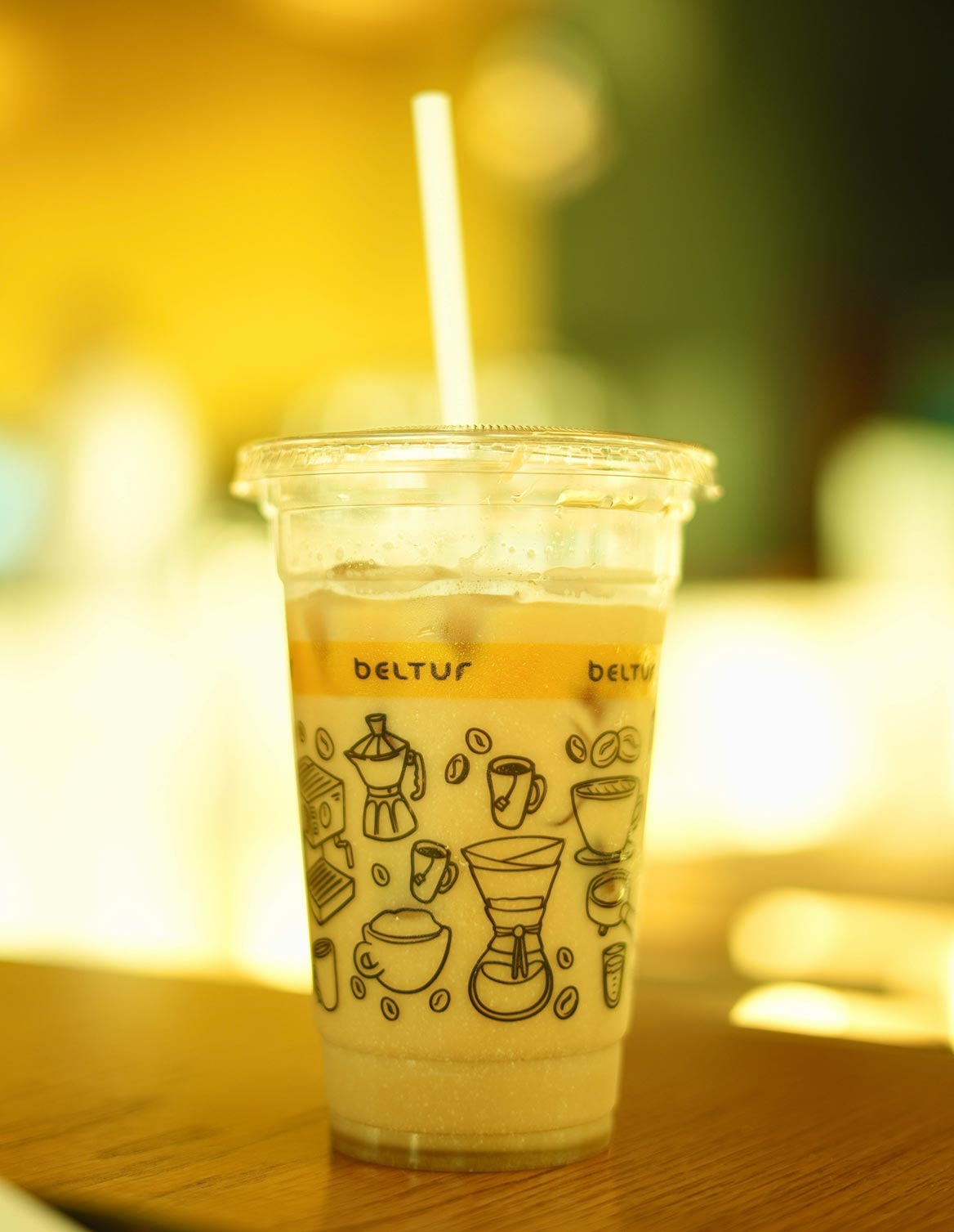
Inks are slightly translucent, so when printed on a clear material they are somewhat see through like drawing on a with a felt tip, this can be an attractive look to play with but could cause a colour change in your design if the product you place the label on is coloured. This is where white ink plays a pivotal role in clear labels printing but does come with an additional expense to consider.
Key Features:
- Cost Efficiency: Saves money by avoiding the extra white ink layer.
- Colour Translucency: Give your colour a see-through look, useful for frosted effects.
- Multiple applications: Clear can be printed traditionally or reverse for inside a window.
Best For:
- Projects that work well with a see-through, integrated design.
- Budget-friendly applications where a natural look is desired.
- Situations where a soft, subtle appearance fits the overall aesthetic.
Design Tips – Eliminating borders with a transparent material:
Using clear or transparent labels is a great way to achieve that 'no border' look. This approach is particularly effective when you want to avoid any visible white border, yet maintain a unique, custom shape for your artwork. By opting for transparent material, only your design and chosen colours appear on the final product, allowing the underlying surface to show through. This creates a seamless, integrated appearance that makes your artwork look as though it's printed directly on the item.
Key benefits include:
- Your design appears more fluid and modern, without the interruption of a border.
- A borderless look can help your product stand out on shelves or in displays.
- Transparent labels work well on a variety of substrates, making them ideal for products where the underlying material is part of the overall design.
For these reasons, many customers choose transparent labels to deliver a sleek, professional finish that complements the product's natural look.
What is White Ink Printing?
Also referred to as; Base Printing, White backing, White underpin.
White ink printing involves a special ink, a premium white coloured ink that combined with a clear material can offer two advantages. White ink allows white areas on your design to be printed which otherwise would have relied on the white colour of a paper or polypropylene material. White ink also allows a base layer to be printed meaning any colour printed over that layer remains opaque and vibrant giving you the ultimate control over your artwork, allowing both clear/transparent areas and opaque sections on the same label.
White ink layering is especially handy for reverse printed labels and stickers. In this process, the design is printed facing the adhesive side and backed with white ink either selectively for transparent areas or as a full-coverage layer to give a classic label look with a white background. This method lets you stick the label on the inside of a window, so it appears correctly from the outside, perfect for parking permits, membership stickers on cars, or shop window advertisement. Plus, the window itself acts as an extra layer of protection, keeping your design looking sharp for longer.
There are some drawbacks, White ink comes at an extra cost and setting artwork up for specific white ink areas take additional time so is more complex but produces a more vibrant and unique label.
Key Features:
Enhanced Vibrancy: Colours appear bold and vivid over the white base.
Clear/Opaque: You can choose specific clear and opaque areas.
White areas: You can apply white details to your label without the need for a white material.
Best For:
Designs that require opaque colour and transparent areas.
Design that requires white elements such as text or design elements.
Window stickers that require a white background.
Design Tip: Enhancing Visual Interest with White Ink
White ink isn't just about boosting colour vibrance, it can also serve as a design element in its own right. Whether you use it for text or as a decorative accent, incorporating white ink can add layers of visual interest to your artwork. When combined with transparent areas, white ink helps your design pop and provides a crisp, clean contrast that draws the eye, making your label truly stand out.
Sales Tip: Our Premium White Ink Upgrade
Initially, we experimented with standard white ink, but we found it didn't offer the opaqueness we desired. To address this, we invested in a premium white ink, essentially providing the equivalent of two hits of white ink. This thicker formulation ensures a richer, more substantial white layer that enhances both the vibrance and clarity of your design. The best part? We've absorbed this cost, so you benefit from superior quality without any extra charge. Our customers have given us excellent feedback on the improved look and consistency of labels printed with this premium white ink.
Design Tip: Customisable White Ink Gradients for a Milky Effect
A common question we receive is whether we can print gradients or adjust the opacity of our white ink, and the answer is a resounding yes. We can create smooth gradients with varying opacity levels, perfect for achieving a milky effect. This technique allows your design to maintain high opacity at one end and gradually fade to 0% seamlessly, ensuring your colours remain vibrant while transitioning elegantly.
Which should I choose?
Choose White Ink Printing if:
You need your colour to be opaque with either specific transparent areas or require a white backing on a reverse label. Artworks with white elements will also need white ink, remember, ink is slightly translucent without a white base your colour will be slightly see through and may not look as vibrant particularly if your container or product is a strong colour.
Choose No White Ink Printing if:
You are after a clear material with a cost-effective solution and If your design would work well with the clear material and doesn't need an extra base such as a carbonated drink in a clear bottle, where the liquid being seen trough the label is part of the effect. If you're after a subtle, integrated look then clear without white ink will look great, this also applied if you design is only black and clear, black prints almost opaque on its own and can be a good venture into clear without the additional cost of a premium ink base.